Accord · CRM design
Making Business Data Feel Simple
A modern CRM for small companies and teams, designed to make important information easy to find and everyday work easier to understand.
- Focus
- Product & interface design
- Audience
- Small companies & teams
- Outcome
- CRM interface design

01 Problem
A CRM should help a team understand its relationships. For a small company, that means seeing who a business is, what makes it relevant, and where to focus next. My goal with Accord was to create a product that felt useful from the first screen and simple enough to become part of everyday work.
The design challenge was balancing information with clarity. Company records can include domains, categories, employee counts, revenue, and addresses. Showing everything with equal emphasis creates a wall of data. Hiding too much makes comparison harder. I wanted the important information to be readable immediately, with the supporting details available in the same view.
I treated simplicity as a question of hierarchy and predictable behavior. The interface needed to give each type of information a clear place, while keeping the path between records and the team’s everyday tools easy to understand.
02 Reasoning
I chose a table as the main structure for company records. A shared row and column layout lets someone compare the same attribute across several companies without opening each one. The challenge was making that density feel organized, especially when a record has several categories or a long address.
Linear was a visual reference for this project. I was drawn to its restrained surfaces, compact navigation, and clear separation between the workspace and its content. I carried that direction into Accord through quiet borders, consistent spacing, and a small number of emphasis levels, adapting the layout to a CRM’s records and attributes.
The guiding question was: what should someone notice first? My answer was the current workspace, the type of record they are viewing, and the identity of each company. Everything else needed to support that reading order.
I also wanted to avoid making a small team learn a different visual language for each area. Repeated spacing, familiar labels, and a stable sidebar provide a common frame for the information. The tradeoff is a deliberately restrained interface: individual features receive less visual attention so the records themselves can carry more of the page.
03 Decisions
A clear place for everything
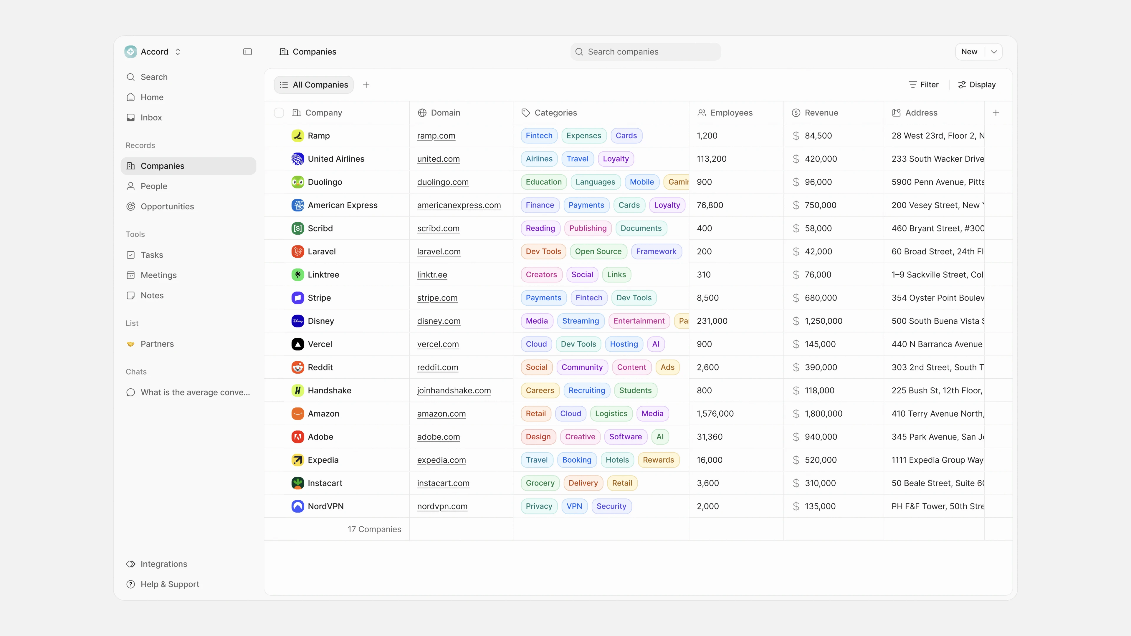
I separated the sidebar into Records and Tools. Companies, People, and Opportunities describe the relationships the team works with. Tasks, Meetings, and Notes describe supporting activities. This grouping gives the navigation a readable structure, rather than asking every item to compete in one uninterrupted list.
The selected Companies item stays visibly highlighted. The workspace control sits above navigation, while Integrations and Help & Support sit at the bottom. That keeps the frequent destinations together and gives supporting actions a predictable place.
Useful information first
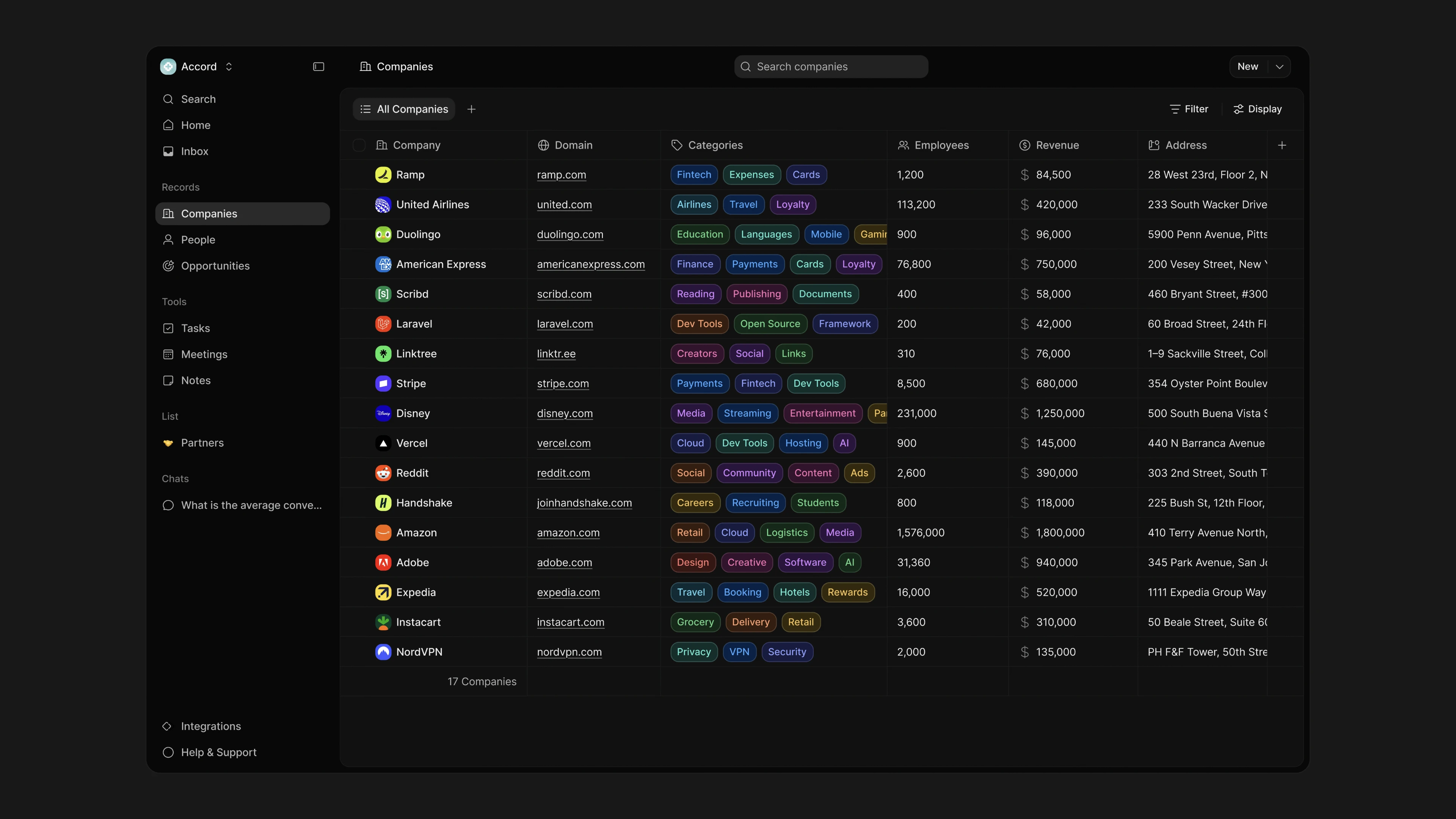
The company name anchors each row, supported by a recognizable icon. Other attributes sit in consistent columns with quieter separators. Color is concentrated in the category labels, where it helps distinguish groups without turning the whole table into a set of competing signals.
Every colored category also has a text label. The meaning remains explicit without relying on color alone. Longer values stay within the table’s column structure, preserving the overall scan pattern. This trades a little immediate detail for a more stable overview.
That balance matters in a dense CRM. Large cards would give each company more breathing room, but make comparisons across several attributes less direct. I used compact rows instead, with alignment doing much of the organizational work. The table provides a consistent rhythm even when the content varies from one company to another.
Controls in context
Search companies appears in the page header. Filter and Display sit above the table, beside the current view. New has a consistent position in the upper-right corner. These placements distinguish finding a record, changing the view, and adding something new without introducing another navigation layer.
One system, two themes
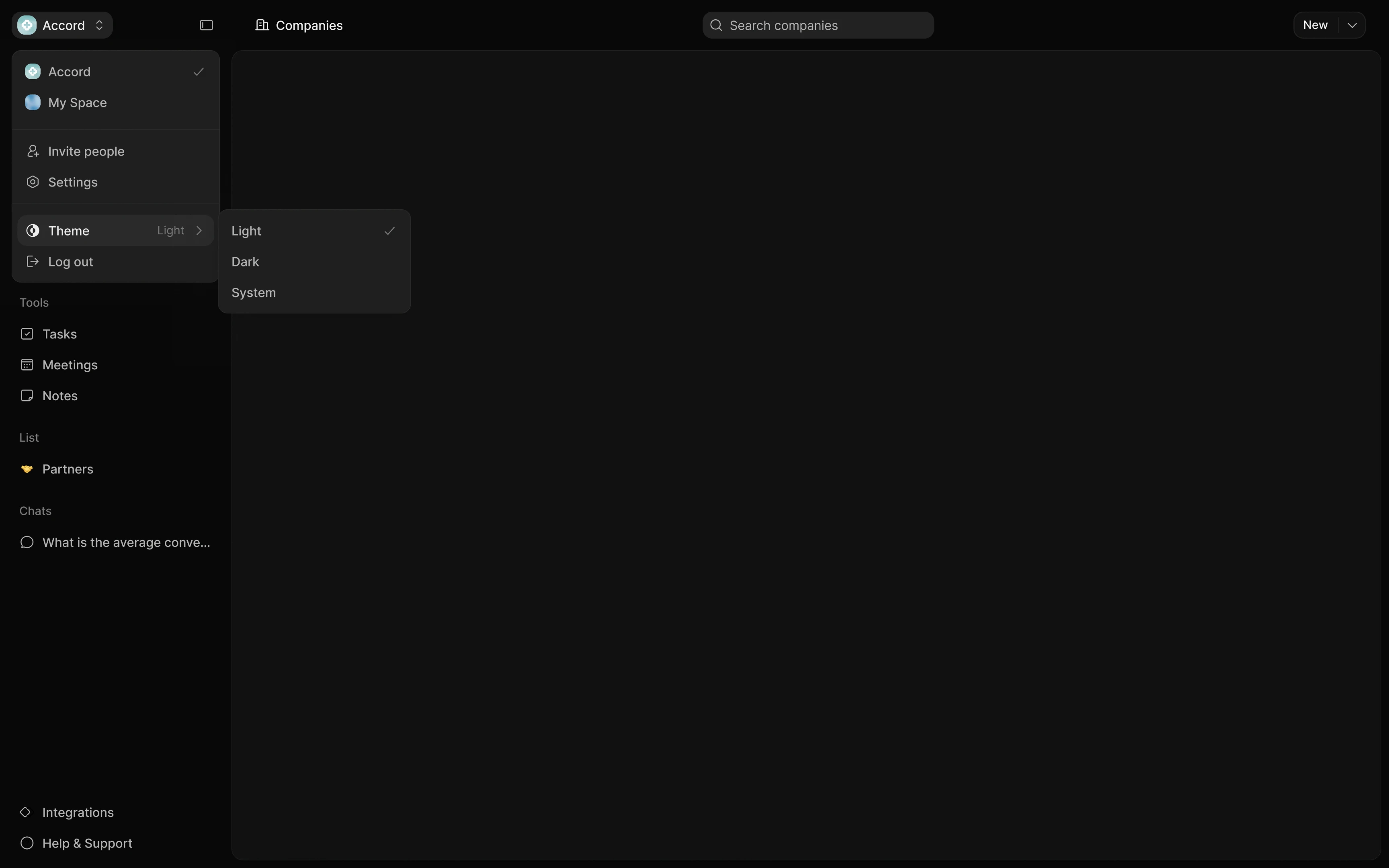
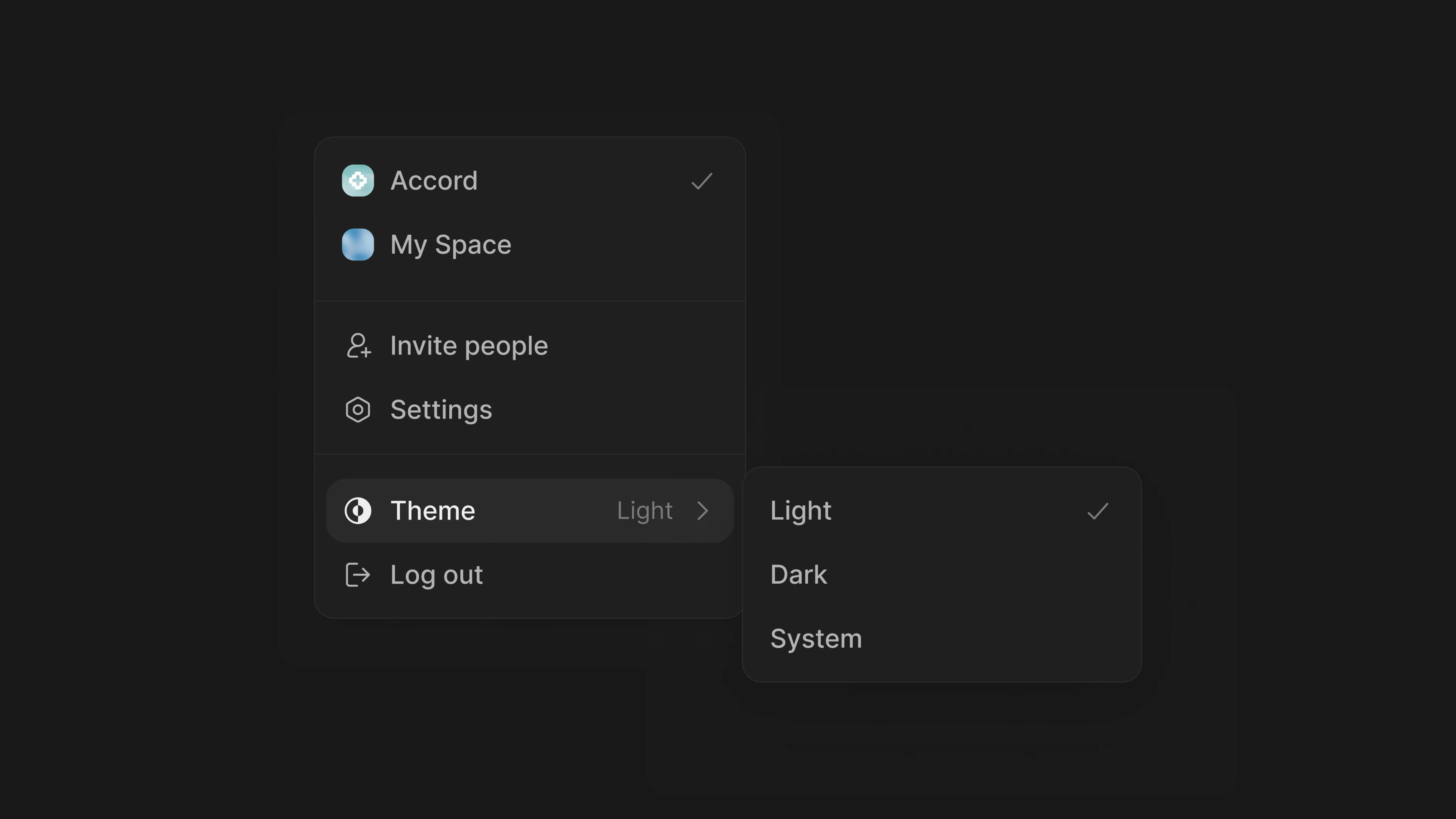
I designed light and dark versions around the same hierarchy. The structure, labels, and positions remain consistent; surfaces, borders, and category treatments change with the theme. The workspace menu offers Light, Dark, and System together, keeping appearance preferences close to other workspace settings.
04 Solution
The companies workspace
The resulting screen brings the company list and its supporting controls into one focused workspace. Someone arriving here can identify the current record type, scan company names, and compare attributes across rows. The table remains the main visual element, with navigation and controls framing it.
For a person looking for a particular company, the search field offers a clear starting point. For someone reviewing the broader list, categories and aligned columns support comparison. Filter and Display are placed where a person would look to adjust what they see. These screens establish the interface for those tasks; they do not demonstrate every interaction or implementation state.
Workspace settings
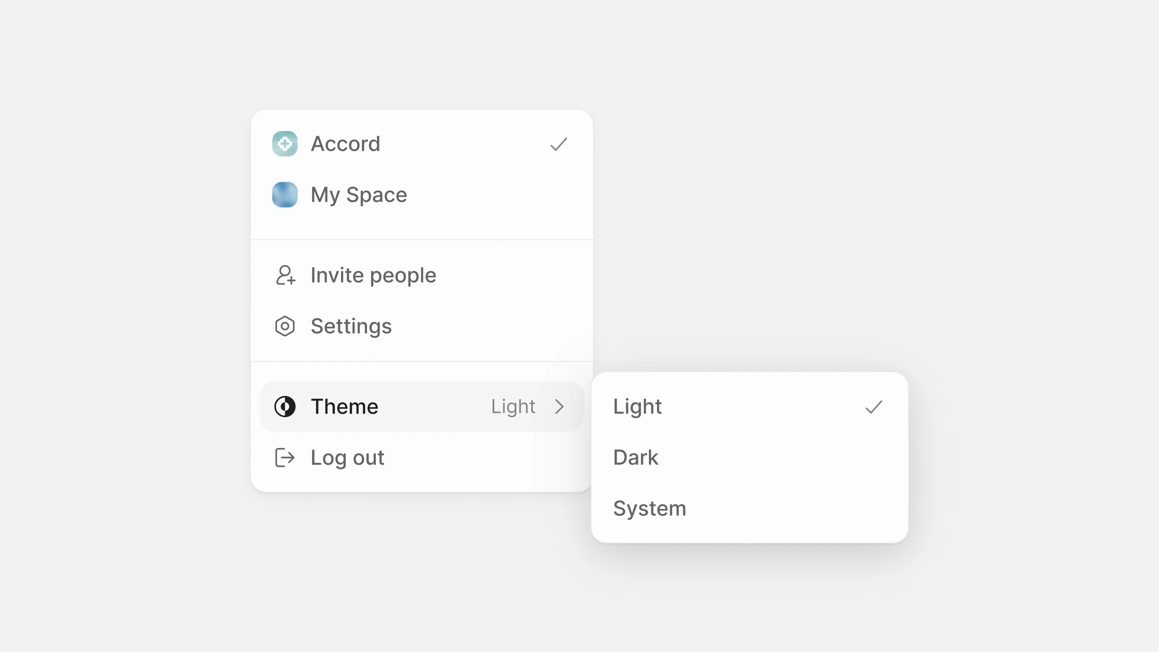
The workspace menu brings together switching spaces, inviting people, settings, appearance, and logout. Separators group related actions, while the nested theme menu keeps the first level short. A checkmark makes the selected option visible without adding explanatory text to every row.
I kept the light and dark menus structurally identical. This is a small detail, but it reinforces the broader principle behind Accord: the interface should feel familiar as the context changes.
The theme examples also show how I approached emphasis. A selected row uses a contained surface change, while dividers quietly separate groups of actions. Neither needs a bright accent to explain the structure. Keeping those signals restrained leaves stronger colors available for meaningful information, such as the categories in the company table.
05 Impact
The design brings company records, team tools, and workspace preferences into a consistent interface. The concrete outcome is a defined navigation structure, a clear hierarchy for dense business information, and coordinated light and dark treatments. Together, these decisions express the original goal: a CRM that feels straightforward to use.
The intended benefit is less effort understanding where information lives and which controls belong to the current task. That is a design intention, not a measured business result. I am presenting the interface work here without claiming adoption, faster task completion, or improvements in sales performance.
The next step would be to test the design with people in small teams: ask them to find a company, locate an attribute, and identify where they would manage a related task. I would watch for hesitation, unclear labels, and information that needs more room. Those observations would help assess whether the visual simplicity also translates into practical clarity.
I would pay particular attention to the compromise between density and readability. If people repeatedly miss an attribute or confuse a navigation group, that would be a reason to reconsider the hierarchy. A calm appearance is valuable only when it helps someone understand the information in front of them.