Pascal · Note-taking app design
A Quiet Space to Think
A local space for personal notes, designed to keep the interface quiet and the writing at the center.
- Focus
- Product & interface design
- Purpose
- Writing without distractions
- Outcome
- Note-taking app design
01 Problem
Writing a thought down should not require managing an interface first. My starting point for Pascal was a local note-taking app where the page feels ready for whatever someone wants to say. The goal was to give personal writing enough space to develop without surrounding it with competing signals.
A note-taking tool still needs navigation, search, and ways to structure a document. Removing those things would make the screen simpler, but could make the work harder. The challenge was deciding what deserves a permanent place and what can stay out of sight until it becomes useful.
I approached this as a design problem rather than a claim about user research. I wanted the document to be the first thing someone notices, while the rest of the workspace remains understandable. Visual quiet was a way to support attention, not an excuse to make important controls difficult to find.
02 Reasoning
Obsidian was an inspiration for the idea of a local, personal space for notes. With Pascal, I focused on the interface around that idea: a familiar workspace that gives writing priority over configuration. This case presents that design direction, without making claims about storage implementation, file formats, or compatibility with other applications.
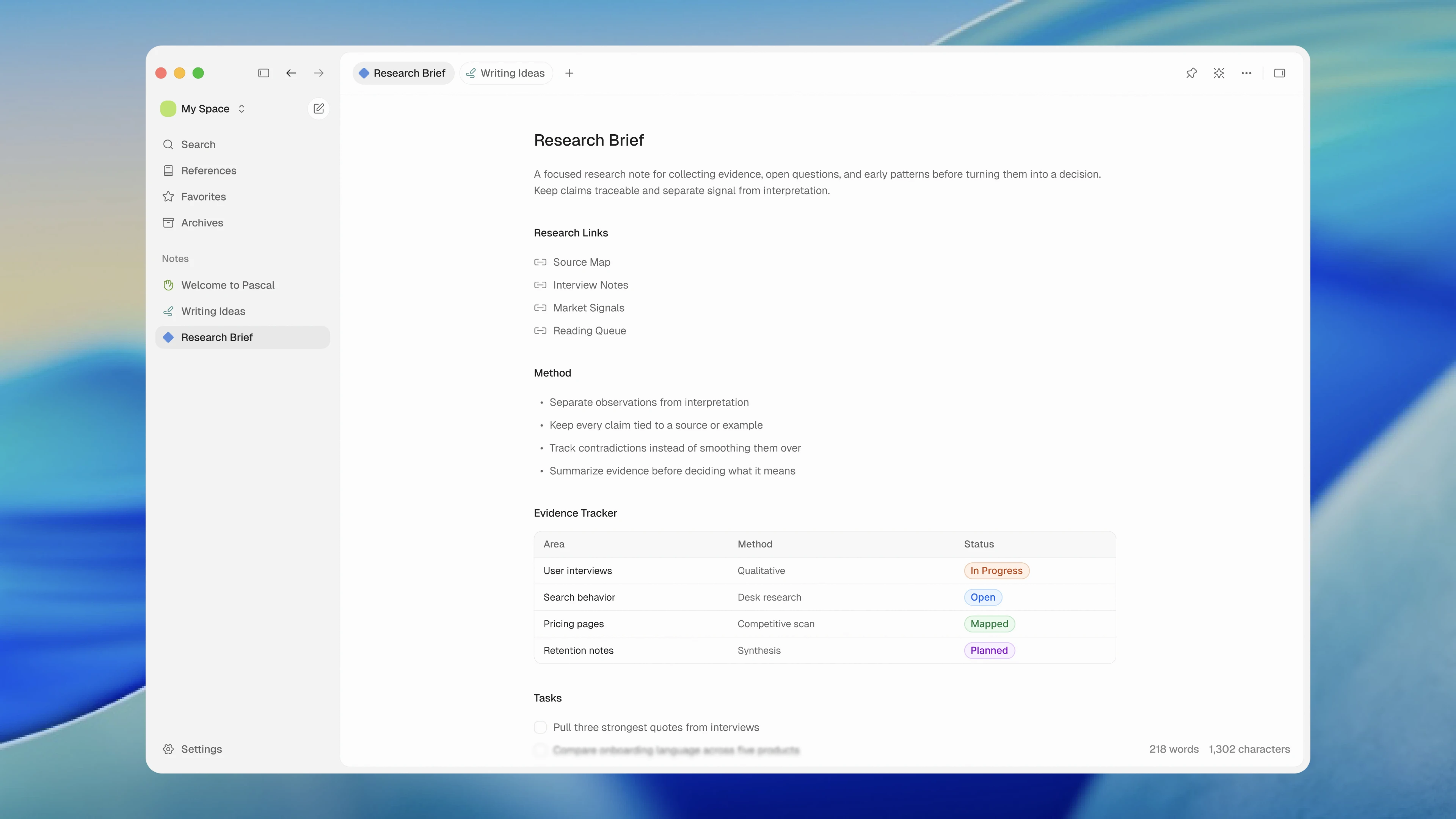
I chose a restrained layout with three recognizable areas: navigation, open notes, and the document itself. Each has a different visual weight. The editor gets the most space, tabs keep nearby documents available, and the sidebar provides orientation without becoming the main event.
The key tradeoff is between immediate access and persistent clutter. A control that is always visible is easy to discover, but it also asks for attention every time the screen is viewed. I used contextual menus to keep useful options available while reducing how much of the interface needs to be read during writing.
03 Decisions
Let the writing lead
The document sits in a generous content area with a clear title and a consistent reading width. Headings, paragraphs, lists, and tables create structure inside the note. The surrounding surfaces stay restrained so that the hierarchy comes primarily from the writing itself.
I avoided giving every piece of interface information the same emphasis. Word and character counts sit quietly near the bottom, while document controls stay near the top edge. These details remain available without breaking up the text or competing with the next sentence.
Readable typography is part of that balance. A limited set of text sizes establishes the difference between a title, a section heading, and supporting information. I used whitespace to separate ideas instead of adding decorative containers around every block. The page can contain several kinds of content while still feeling like one document.
Navigation at the edges
The sidebar separates general destinations from the list of notes. Search, References, Favorites, and Archives form one group; individual notes form another. A selected surface marks the current note, and small icons help distinguish items without introducing large decorative elements.
Tabs provide another layer of orientation when more than one note is open. I kept their treatment compact and aligned with the workspace frame. This creates a visible relationship between the selected document and its content, while leaving the editor as the largest continuous surface.
The sidebar also presents a deliberate compromise. Keeping it visible helps someone understand where they are, but takes space and introduces another set of labels. The command menu includes a Toggle Sidebar action as a direction for reducing that surrounding interface when writing becomes the main task. The provided screens show the navigation in its visible state.
Tools when needed
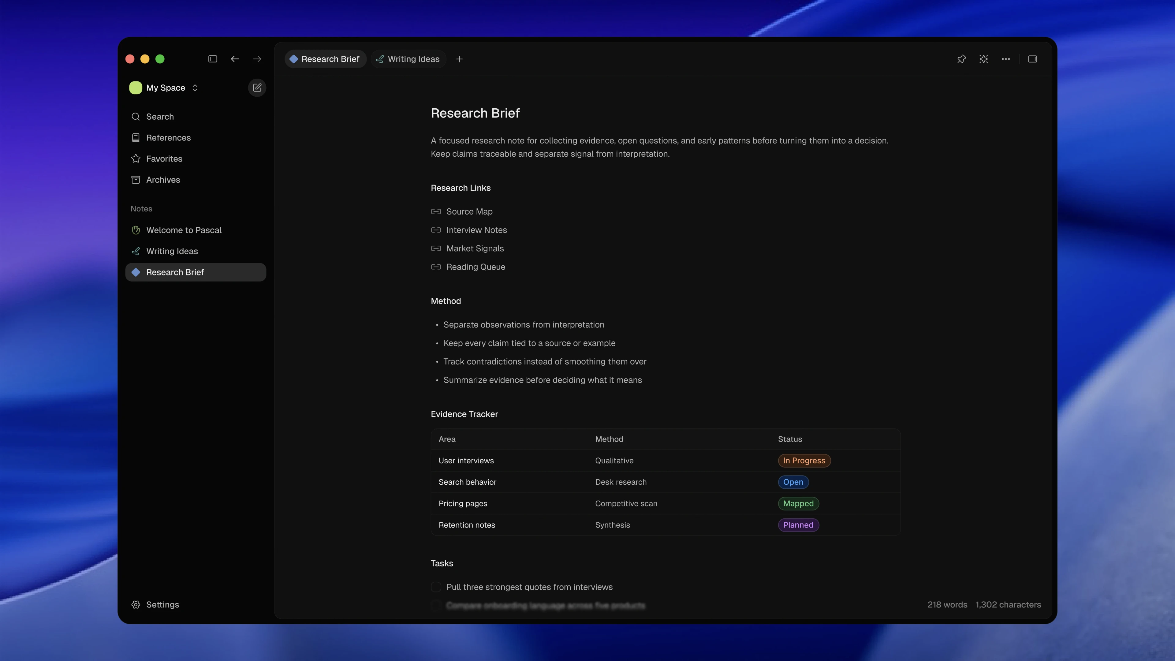
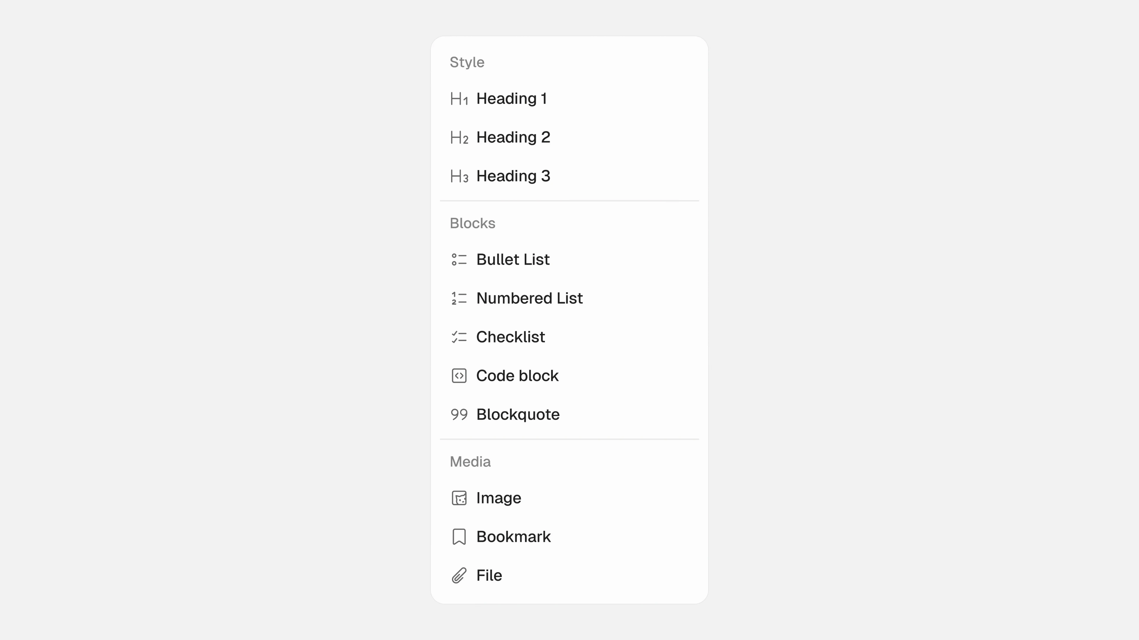
The command menu combines note destinations with actions in separate, labelled groups. The formatting menu follows the same principle, organizing options under Style, Blocks, and Media. Grouping keeps a long set of possibilities readable without placing all of them permanently around the document.
04 Solution
One workspace, two themes
The resulting design presents a note as the center of a personal workspace. Someone can identify the current document, see nearby notes, and locate the supporting controls without leaving the page’s visual context. The example includes structured content to show how the editor handles more than a blank paragraph.
Light and dark versions use the same layout and emphasis. Borders, selected surfaces, and secondary labels change with the palette, while positions remain familiar. The research brief shown here is demonstration content for the interface; its interview and research references do not describe work conducted for this project.
A shorter path to actions
The command menu places a search field above two distinct groups. Notes appear first, followed by actions such as Create New Note, Settings, and Toggle Sidebar. This provides a compact interface for finding a destination or choosing a command, without turning the main screen into a toolbar.
I designed both themes with the same spacing and grouping. The screenshots establish the menu’s visual structure; they do not demonstrate search behavior, keyboard shortcuts, or completed interactions. Those details would need to be explored and checked in a working prototype.
Structure without clutter
The formatting menu makes headings, lists, checklists, code blocks, quotations, and media options visible in a single organized panel. Text labels carry the meaning, with icons providing secondary cues. This lets the main editor remain visually quiet while still showing a clear direction for richer notes.
I kept the labels explicit rather than asking icons to explain everything. Headings belong together, list types belong together, and media has its own group. The extra labels make the menu slightly taller, but reduce the amount of interpretation needed when looking for a specific kind of block.
05 Impact
The outcome is a coherent interface direction: a quiet editor, secondary navigation, grouped contextual tools, and coordinated light and dark themes. Together, they express what I wanted Pascal to be: a place where the design supports a thought without continually interrupting it.
The expected benefit is less visual competition during writing. This is an intention, not a measured improvement or a claim about a released application. A next step would be a prototype that lets people write a note, find another document, and apply formatting. I would look for interruptions, missed controls, and moments where hiding complexity creates extra effort.
I would judge that next step by the continuity of the writing experience. Can someone return to a sentence after using a tool without having to reorient themselves? Are the available actions understandable when needed? Those questions would help determine whether the quiet appearance translates into a practical sense of focus.